


COMPOSITION
-
Key/Fill ratios and scene composition using false colors
Read more: Key/Fill ratios and scene composition using false colors

To measure the contrast ratio you will need a light meter. The process starts with you measuring the main source of light, or the key light.
Get a reading from the brightest area on the face of your subject. Then, measure the area lit by the secondary light, or fill light. To make sense of what you have just measured you have to understand that the information you have just gathered is in F-stops, a measure of light. With each additional F-stop, for example going one stop from f/1.4 to f/2.0, you create a doubling of light. The reverse is also true; moving one stop from f/8.0 to f/5.6 results in a halving of the light.
Let’s say you grabbed a measurement from your key light of f/8.0. Then, when you measured your fill light area, you get a reading of f/4.0. This will lead you to a contrast ratio of 4:1 because there are two stops between f/4.0 and f/8.0 and each stop doubles the amount of light. In other words, two stops x twice the light per stop = four times as much light at f/8.0 than at f/4.0.

theslantedlens.com/2017/lighting-ratios-photo-video/
Examples in the post


DESIGN


COLOR
-
Tim Kang – calibrated white light values in sRGB color space
Read more: Tim Kang – calibrated white light values in sRGB color space8bit sRGB encoded
2000K 255 139 22
2700K 255 172 89
3000K 255 184 109
3200K 255 190 122
4000K 255 211 165
4300K 255 219 178
D50 255 235 205
D55 255 243 224
D5600 255 244 227
D6000 255 249 240
D65 255 255 255
D10000 202 221 255
D20000 166 196 2558bit Rec709 Gamma 2.4
2000K 255 145 34
2700K 255 177 97
3000K 255 187 117
3200K 255 193 129
4000K 255 214 170
4300K 255 221 182
D50 255 236 208
D55 255 243 226
D5600 255 245 229
D6000 255 250 241
D65 255 255 255
D10000 204 222 255
D20000 170 199 2558bit Display P3 encoded
2000K 255 154 63
2700K 255 185 109
3000K 255 195 127
3200K 255 201 138
4000K 255 219 176
4300K 255 225 187
D50 255 239 212
D55 255 245 228
D5600 255 246 231
D6000 255 251 242
D65 255 255 255
D10000 208 223 255
D20000 175 199 25510bit Rec2020 PQ (100 nits)
2000K 520 435 273
2700K 520 466 358
3000K 520 475 384
3200K 520 480 399
4000K 520 495 446
4300K 520 500 458
D50 520 510 482
D55 520 514 497
D5600 520 514 500
D6000 520 517 509
D65 520 520 520
D10000 479 489 520
D20000 448 464 520
-
What light is best to illuminate gems for resale
Read more: What light is best to illuminate gems for resalewww.palagems.com/gem-lighting2
Artificial light sources, not unlike the diverse phases of natural light, vary considerably in their properties. As a result, some lamps render an object’s color better than others do.
The most important criterion for assessing the color-rendering ability of any lamp is its spectral power distribution curve.
Natural daylight varies too much in strength and spectral composition to be taken seriously as a lighting standard for grading and dealing colored stones. For anything to be a standard, it must be constant in its properties, which natural light is not.
For dealers in particular to make the transition from natural light to an artificial light source, that source must offer:
1- A degree of illuminance at least as strong as the common phases of natural daylight.
2- Spectral properties identical or comparable to a phase of natural daylight.A source combining these two things makes gems appear much the same as when viewed under a given phase of natural light. From the viewpoint of many dealers, this corresponds to a naturalappearance.
The 6000° Kelvin xenon short-arc lamp appears closest to meeting the criteria for a standard light source. Besides the strong illuminance this lamp affords, its spectrum is very similar to CIE standard illuminants of similar color temperature.


-
Colour – MacBeth Chart Checker Detection
Read more: Colour – MacBeth Chart Checker Detectiongithub.com/colour-science/colour-checker-detection
A Python package implementing various colour checker detection algorithms and related utilities.

-
Victor Perez – The Color Management Handbook for Visual Effects Artists
Read more: Victor Perez – The Color Management Handbook for Visual Effects ArtistsDigital Color Principles, Color Management Fundamentals & ACES Workflows

-
PTGui 13 beta adds control through a Patch Editor
Read more: PTGui 13 beta adds control through a Patch EditorAdditions:
- Patch Editor (PTGui Pro)
- DNG output
- Improved RAW / DNG handling
- JPEG 2000 support
- Performance improvements

-
What is OLED and what can it do for your TV
Read more: What is OLED and what can it do for your TVhttps://www.cnet.com/news/what-is-oled-and-what-can-it-do-for-your-tv/
OLED stands for Organic Light Emitting Diode. Each pixel in an OLED display is made of a material that glows when you jab it with electricity. Kind of like the heating elements in a toaster, but with less heat and better resolution. This effect is called electroluminescence, which is one of those delightful words that is big, but actually makes sense: “electro” for electricity, “lumin” for light and “escence” for, well, basically “essence.”
OLED TV marketing often claims “infinite” contrast ratios, and while that might sound like typical hyperbole, it’s one of the extremely rare instances where such claims are actually true. Since OLED can produce a perfect black, emitting no light whatsoever, its contrast ratio (expressed as the brightest white divided by the darkest black) is technically infinite.
OLED is the only technology capable of absolute blacks and extremely bright whites on a per-pixel basis. LCD definitely can’t do that, and even the vaunted, beloved, dearly departed plasma couldn’t do absolute blacks.

-
SecretWeapons MixBox – a practical library for paint-like digital color mixing
Read more: SecretWeapons MixBox – a practical library for paint-like digital color mixingInternally, Mixbox treats colors as real-life pigments using the Kubelka & Munk theory to predict realistic color behavior.
https://scrtwpns.com/mixbox/painter/
https://scrtwpns.com/mixbox.pdf
https://github.com/scrtwpns/mixbox
https://scrtwpns.com/mixbox/docs/

-
Black Body color aka the Planckian Locus curve for white point eye perception
Read more: Black Body color aka the Planckian Locus curve for white point eye perceptionhttp://en.wikipedia.org/wiki/Black-body_radiation

Black-body radiation is the type of electromagnetic radiation within or surrounding a body in thermodynamic equilibrium with its environment, or emitted by a black body (an opaque and non-reflective body) held at constant, uniform temperature. The radiation has a specific spectrum and intensity that depends only on the temperature of the body.
A black-body at room temperature appears black, as most of the energy it radiates is infra-red and cannot be perceived by the human eye. At higher temperatures, black bodies glow with increasing intensity and colors that range from dull red to blindingly brilliant blue-white as the temperature increases.
The Black Body Ultraviolet Catastrophe Experiment

In photography, color temperature describes the spectrum of light which is radiated from a “blackbody” with that surface temperature. A blackbody is an object which absorbs all incident light — neither reflecting it nor allowing it to pass through.
The Sun closely approximates a black-body radiator. Another rough analogue of blackbody radiation in our day to day experience might be in heating a metal or stone: these are said to become “red hot” when they attain one temperature, and then “white hot” for even higher temperatures. Similarly, black bodies at different temperatures also have varying color temperatures of “white light.”
Despite its name, light which may appear white does not necessarily contain an even distribution of colors across the visible spectrum.

Although planets and stars are neither in thermal equilibrium with their surroundings nor perfect black bodies, black-body radiation is used as a first approximation for the energy they emit. Black holes are near-perfect black bodies, and it is believed that they emit black-body radiation (called Hawking radiation), with a temperature that depends on the mass of the hole.
-
Björn Ottosson – OKHSV and OKHSL – Two new color spaces for color picking
Read more: Björn Ottosson – OKHSV and OKHSL – Two new color spaces for color pickinghttps://bottosson.github.io/misc/colorpicker
https://bottosson.github.io/posts/colorpicker/
https://www.smashingmagazine.com/2024/10/interview-bjorn-ottosson-creator-oklab-color-space/
One problem with sRGB is that in a gradient between blue and white, it becomes a bit purple in the middle of the transition. That’s because sRGB really isn’t created to mimic how the eye sees colors; rather, it is based on how CRT monitors work. That means it works with certain frequencies of red, green, and blue, and also the non-linear coding called gamma. It’s a miracle it works as well as it does, but it’s not connected to color perception. When using those tools, you sometimes get surprising results, like purple in the gradient.

There were also attempts to create simple models matching human perception based on XYZ, but as it turned out, it’s not possible to model all color vision that way. Perception of color is incredibly complex and depends, among other things, on whether it is dark or light in the room and the background color it is against. When you look at a photograph, it also depends on what you think the color of the light source is. The dress is a typical example of color vision being very context-dependent. It is almost impossible to model this perfectly.
I based Oklab on two other color spaces, CIECAM16 and IPT. I used the lightness and saturation prediction from CIECAM16, which is a color appearance model, as a target. I actually wanted to use the datasets used to create CIECAM16, but I couldn’t find them.
IPT was designed to have better hue uniformity. In experiments, they asked people to match light and dark colors, saturated and unsaturated colors, which resulted in a dataset for which colors, subjectively, have the same hue. IPT has a few other issues but is the basis for hue in Oklab.
In the Munsell color system, colors are described with three parameters, designed to match the perceived appearance of colors: Hue, Chroma and Value. The parameters are designed to be independent and each have a uniform scale. This results in a color solid with an irregular shape. The parameters are designed to be independent and each have a uniform scale. This results in a color solid with an irregular shape. Modern color spaces and models, such as CIELAB, Cam16 and Björn Ottosson own Oklab, are very similar in their construction.

By far the most used color spaces today for color picking are HSL and HSV, two representations introduced in the classic 1978 paper “Color Spaces for Computer Graphics”. HSL and HSV designed to roughly correlate with perceptual color properties while being very simple and cheap to compute.
Today HSL and HSV are most commonly used together with the sRGB color space.

One of the main advantages of HSL and HSV over the different Lab color spaces is that they map the sRGB gamut to a cylinder. This makes them easy to use since all parameters can be changed independently, without the risk of creating colors outside of the target gamut.

The main drawback on the other hand is that their properties don’t match human perception particularly well.
Reconciling these conflicting goals perfectly isn’t possible, but given that HSV and HSL don’t use anything derived from experiments relating to human perception, creating something that makes a better tradeoff does not seem unreasonable.
With this new lightness estimate, we are ready to look into the construction of Okhsv and Okhsl.


LIGHTING
-
Free HDRI libraries
Read more: Free HDRI librariesnoahwitchell.com
http://www.noahwitchell.com/freebieslocationtextures.com
https://locationtextures.com/panoramas/maxroz.com
https://www.maxroz.com/hdri/listHDRI Haven
https://hdrihaven.com/Poly Haven
https://polyhaven.com/hdrisDomeble
https://www.domeble.com/IHDRI
https://www.ihdri.com/HDRMaps
https://hdrmaps.com/NoEmotionHdrs.net
http://noemotionhdrs.net/hdrday.htmlOpenFootage.net
https://www.openfootage.net/hdri-panorama/HDRI-hub
https://www.hdri-hub.com/hdrishop/hdri.zwischendrin
https://www.zwischendrin.com/en/browse/hdriLonger list here:
https://cgtricks.com/list-sites-free-hdri/

-
What’s the Difference Between Ray Casting, Ray Tracing, Path Tracing and Rasterization? Physical light tracing…
Read more: What’s the Difference Between Ray Casting, Ray Tracing, Path Tracing and Rasterization? Physical light tracing…RASTERIZATION
Rasterisation (or rasterization) is the task of taking the information described in a vector graphics format OR the vertices of triangles making 3D shapes and converting them into a raster image (a series of pixels, dots or lines, which, when displayed together, create the image which was represented via shapes), or in other words “rasterizing” vectors or 3D models onto a 2D plane for display on a computer screen.For each triangle of a 3D shape, you project the corners of the triangle on the virtual screen with some math (projective geometry). Then you have the position of the 3 corners of the triangle on the pixel screen. Those 3 points have texture coordinates, so you know where in the texture are the 3 corners. The cost is proportional to the number of triangles, and is only a little bit affected by the screen resolution.
In computer graphics, a raster graphics or bitmap image is a dot matrix data structure that represents a generally rectangular grid of pixels (points of color), viewable via a monitor, paper, or other display medium.
With rasterization, objects on the screen are created from a mesh of virtual triangles, or polygons, that create 3D models of objects. A lot of information is associated with each vertex, including its position in space, as well as information about color, texture and its “normal,” which is used to determine the way the surface of an object is facing.
Computers then convert the triangles of the 3D models into pixels, or dots, on a 2D screen. Each pixel can be assigned an initial color value from the data stored in the triangle vertices.
Further pixel processing or “shading,” including changing pixel color based on how lights in the scene hit the pixel, and applying one or more textures to the pixel, combine to generate the final color applied to a pixel.
The main advantage of rasterization is its speed. However, rasterization is simply the process of computing the mapping from scene geometry to pixels and does not prescribe a particular way to compute the color of those pixels. So it cannot take shading, especially the physical light, into account and it cannot promise to get a photorealistic output. That’s a big limitation of rasterization.
There are also multiple problems:
If you have two triangles one is behind the other, you will draw twice all the pixels. you only keep the pixel from the triangle that is closer to you (Z-buffer), but you still do the work twice.
The borders of your triangles are jagged as it is hard to know if a pixel is in the triangle or out. You can do some smoothing on those, that is anti-aliasing.
You have to handle every triangles (including the ones behind you) and then see that they do not touch the screen at all. (we have techniques to mitigate this where we only look at triangles that are in the field of view)
Transparency is hard to handle (you can’t just do an average of the color of overlapping transparent triangles, you have to do it in the right order)


RAY CASTING
It is almost the exact reverse of rasterization: you start from the virtual screen instead of the vector or 3D shapes, and you project a ray, starting from each pixel of the screen, until it intersect with a triangle.The cost is directly correlated to the number of pixels in the screen and you need a really cheap way of finding the first triangle that intersect a ray. In the end, it is more expensive than rasterization but it will, by design, ignore the triangles that are out of the field of view.
You can use it to continue after the first triangle it hit, to take a little bit of the color of the next one, etc… This is useful to handle the border of the triangle cleanly (less jagged) and to handle transparency correctly.
RAYTRACING


Same idea as ray casting except once you hit a triangle you reflect on it and go into a different direction. The number of reflection you allow is the “depth” of your ray tracing. The color of the pixel can be calculated, based off the light source and all the polygons it had to reflect off of to get to that screen pixel.The easiest way to think of ray tracing is to look around you, right now. The objects you’re seeing are illuminated by beams of light. Now turn that around and follow the path of those beams backwards from your eye to the objects that light interacts with. That’s ray tracing.
Ray tracing is eye-oriented process that needs walking through each pixel looking for what object should be shown there, which is also can be described as a technique that follows a beam of light (in pixels) from a set point and simulates how it reacts when it encounters objects.
Compared with rasterization, ray tracing is hard to be implemented in real time, since even one ray can be traced and processed without much trouble, but after one ray bounces off an object, it can turn into 10 rays, and those 10 can turn into 100, 1000…The increase is exponential, and the the calculation for all these rays will be time consuming.
Historically, computer hardware hasn’t been fast enough to use these techniques in real time, such as in video games. Moviemakers can take as long as they like to render a single frame, so they do it offline in render farms. Video games have only a fraction of a second. As a result, most real-time graphics rely on the another technique called rasterization.

PATH TRACING
Path tracing can be used to solve more complex lighting situations.
Path tracing is a type of ray tracing. When using path tracing for rendering, the rays only produce a single ray per bounce. The rays do not follow a defined line per bounce (to a light, for example), but rather shoot off in a random direction. The path tracing algorithm then takes a random sampling of all of the rays to create the final image. This results in sampling a variety of different types of lighting.When a ray hits a surface it doesn’t trace a path to every light source, instead it bounces the ray off the surface and keeps bouncing it until it hits a light source or exhausts some bounce limit.
It then calculates the amount of light transferred all the way to the pixel, including any color information gathered from surfaces along the way.
It then averages out the values calculated from all the paths that were traced into the scene to get the final pixel color value.It requires a ton of computing power and if you don’t send out enough rays per pixel or don’t trace the paths far enough into the scene then you end up with a very spotty image as many pixels fail to find any light sources from their rays. So when you increase the the samples per pixel, you can see the image quality becomes better and better.
Ray tracing tends to be more efficient than path tracing. Basically, the render time of a ray tracer depends on the number of polygons in the scene. The more polygons you have, the longer it will take.
Meanwhile, the rendering time of a path tracer can be indifferent to the number of polygons, but it is related to light situation: If you add a light, transparency, translucence, or other shader effects, the path tracer will slow down considerably.
blogs.nvidia.com/blog/2018/03/19/whats-difference-between-ray-tracing-rasterization/
https://en.wikipedia.org/wiki/Rasterisation
https://www.quora.com/Whats-the-difference-between-ray-tracing-and-path-tracing
-
Rec-2020 – TVs new color gamut standard used by Dolby Vision?
Read more: Rec-2020 – TVs new color gamut standard used by Dolby Vision?https://www.hdrsoft.com/resources/dri.html#bit-depth
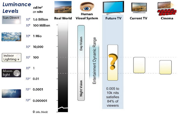
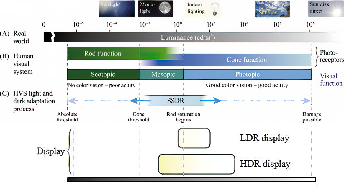
The dynamic range is a ratio between the maximum and minimum values of a physical measurement. Its definition depends on what the dynamic range refers to.
For a scene: Dynamic range is the ratio between the brightest and darkest parts of the scene.
For a camera: Dynamic range is the ratio of saturation to noise. More specifically, the ratio of the intensity that just saturates the camera to the intensity that just lifts the camera response one standard deviation above camera noise.
For a display: Dynamic range is the ratio between the maximum and minimum intensities emitted from the screen.
The Dynamic Range of real-world scenes can be quite high — ratios of 100,000:1 are common in the natural world. An HDR (High Dynamic Range) image stores pixel values that span the whole tonal range of real-world scenes. Therefore, an HDR image is encoded in a format that allows the largest range of values, e.g. floating-point values stored with 32 bits per color channel. Another characteristics of an HDR image is that it stores linear values. This means that the value of a pixel from an HDR image is proportional to the amount of light measured by the camera.
For TVs HDR is great, but it’s not the only new TV feature worth discussing.
Wide color gamut, or WCG, is often lumped in with HDR. While they’re often found together, they’re not intrinsically linked. Where HDR is an increase in the dynamic range of the picture (with contrast and brighter highlights in particular), a TV’s wide color gamut coverage refers to how much of the new, larger color gamuts a TV can display.
Wide color gamuts only really matter for HDR video sources like UHD Blu-rays and some streaming video, as only HDR sources are meant to take advantage of the ability to display more colors.
www.cnet.com/how-to/what-is-wide-color-gamut-wcg/
Color depth is only one aspect of color representation, expressing the precision with which the amount of each primary can be expressed through a pixel; the other aspect is how broad a range of colors can be expressed (the gamut)
Image rendering bit depth
Wide color gamuts include a greater number of colors than what most current TVs can display, so the greater a TV’s coverage of a wide color gamut, the more colors a TV will be able to reproduce.
When we talk about a color space or color gamut we refer to the range of color values stored in an image. The perception of these color also requires a display that has been tuned with to resolve these color profiles at best. This is often referred to as a ‘viewer lut’.
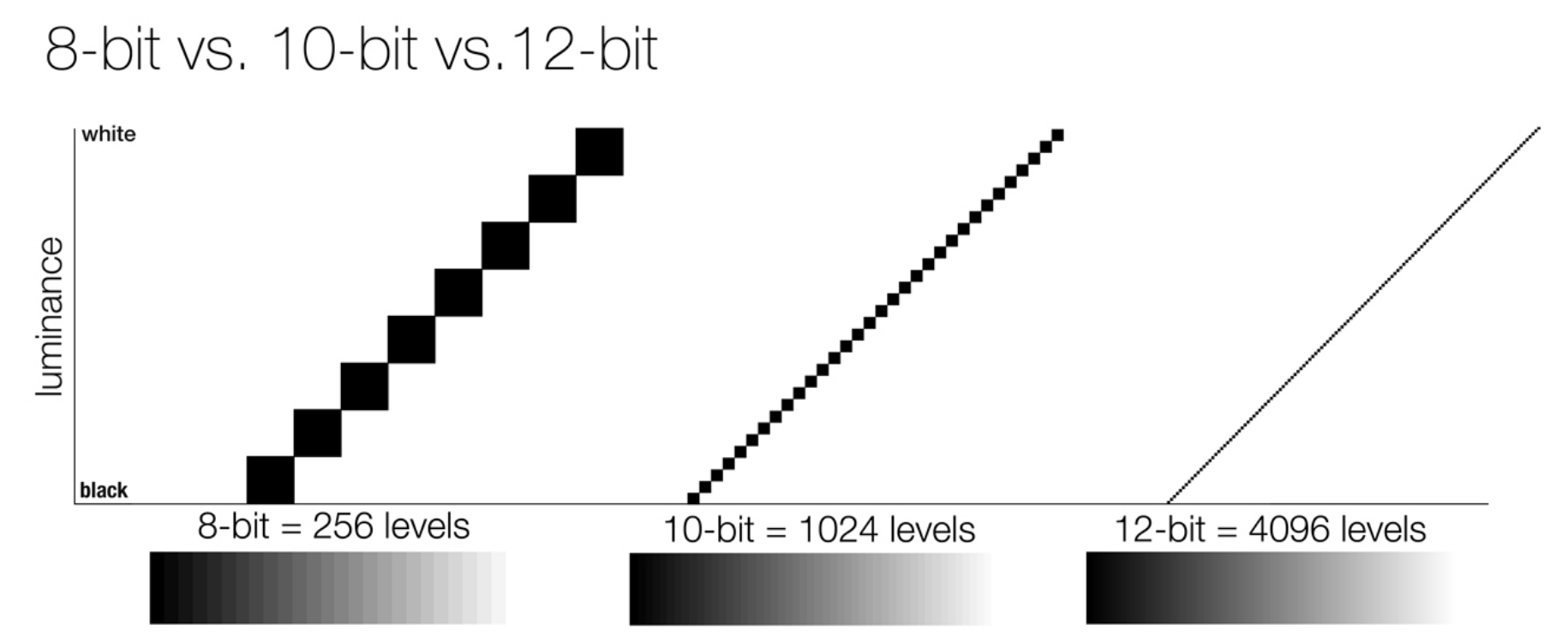
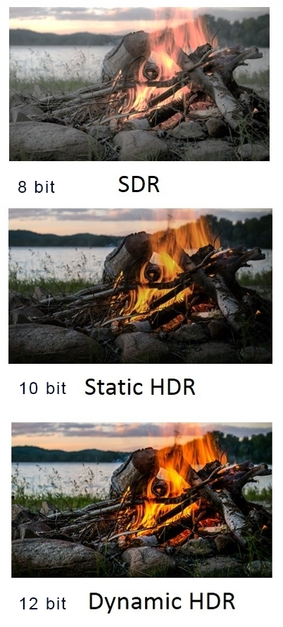
So this comes also usually paired with an increase in bit depth, going from the old 8 bit system (256 shades per color, with the potential of over 16.7 million colors: 256 green x 256 blue x 256 red) to 10 (1024+ shades per color, with access to over a billion colors) or higher bits, like 12 bit (4096 shades per RGB for 68 billion colors).
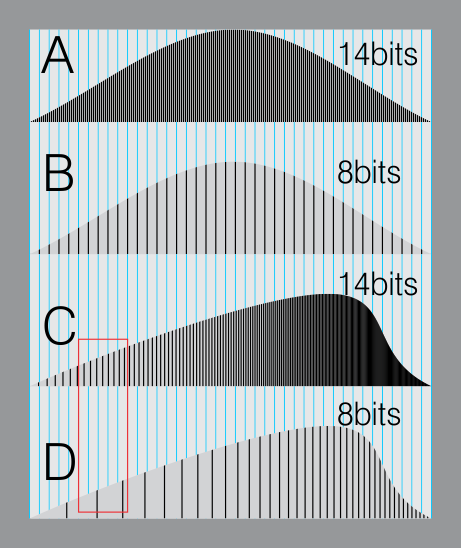
The advantage of higher bit depth is in the ability to bias color with the minimum loss.
For an extreme example, raising the brightness from a completely dark image allows for better reproduction, independently on the reproduction medium, due to the amount of data available at editing time:
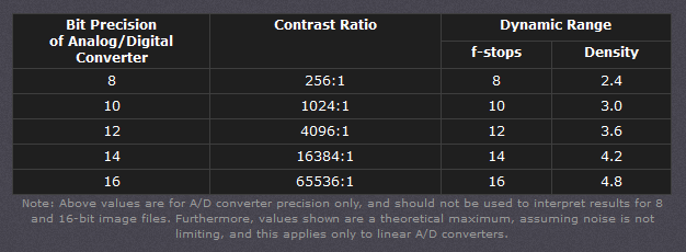
For reference, 8-bit images (i.e. 24 bits per pixel for a color image) are considered Low Dynamic Range.
They can store around 5 stops of light and each pixel carry a value from 0 (black) to 255 (white).
As a comparison, DSLR cameras can capture ~12-15 stops of light and they use RAW files to store the information.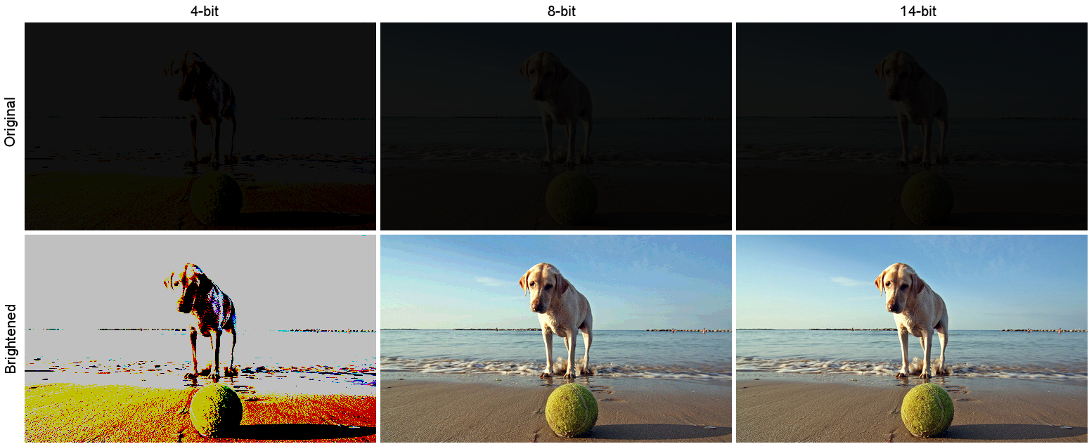
https://www.cambridgeincolour.com/tutorials/dynamic-range.htm
https://www.hdrsoft.com/resources/dri.html#bit-depth
Note that the number of bits itself may be a misleading indication of the real dynamic range that the image reproduces — converting a Low Dynamic Range image to a higher bit depth does not change its dynamic range, of course.
- 8-bit images (i.e. 24 bits per pixel for a color image) are considered Low Dynamic Range.
- 16-bit images (i.e. 48 bits per pixel for a color image) resulting from RAW conversion are still considered Low Dynamic Range, even though the range of values they can encode is significantly higher than for 8-bit images (65536 versus 256). Note that converting a RAW file involves applying a tonal curve that compresses the dynamic range of the RAW data so that the converted image shows correctly on low dynamic range monitors. The need to adapt the output image file to the dynamic range of the display is the factor that dictates how much the dynamic range is compressed, not the output bit-depth. By using 16 instead of 8 bits, you will gain precision but you will not gain dynamic range.
- 32-bit images (i.e. 96 bits per pixel for a color image) are considered High Dynamic Range.Unlike 8- and 16-bit images which can take a finite number of values, 32-bit images are coded using floating point numbers, which means the values they can take is unlimited.It is important to note, though, that storing an image in a 32-bit HDR format is a necessary condition for an HDR image but not a sufficient one. When an image comes from a single capture with a standard camera, it will remain a Low Dynamic Range image,
Also note that bit depth and dynamic range are often confused as one, but are indeed separate concepts and there is no direct one to one relationship between them. Bit depth is about capacity, dynamic range is about the actual ratio of data stored.
The bit depth of a capturing or displaying device gives you an indication of its dynamic range capacity. That is, the highest dynamic range that the device would be capable of reproducing if all other constraints are eliminated.https://rawpedia.rawtherapee.com/Bit_Depth
Finally, note that there are two ways to “count” bits for an image — either the number of bits per color channel (BPC) or the number of bits per pixel (BPP). A bit (0,1) is the smallest unit of data stored in a computer.
For a grayscale image, 8-bit means that each pixel can be one of 256 levels of gray (256 is 2 to the power 8).
For an RGB color image, 8-bit means that each one of the three color channels can be one of 256 levels of color.
Since each pixel is represented by 3 colors in this case, 8-bit per color channel actually means 24-bit per pixel.Similarly, 16-bit for an RGB image means 65,536 levels per color channel and 48-bit per pixel.
To complicate matters, when an image is classified as 16-bit, it just means that it can store a maximum 65,535 values. It does not necessarily mean that it actually spans that range. If the camera sensors can not capture more than 12 bits of tonal values, the actual bit depth of the image will be at best 12-bit and probably less because of noise.
The following table attempts to summarize the above for the case of an RGB color image.
Type of digital support Bit depth per color channel Bit depth per pixel FStops Theoretical maximum Dynamic Range Reality 8-bit 8 24 8 256:1 most consumer images 12-bit CCD 12 36 12 4,096:1 real maximum limited by noise 14-bit CCD 14 42 14 16,384:1 real maximum limited by noise 16-bit TIFF (integer) 16 48 16 65,536:1 bit-depth in this case is not directly related to the dynamic range captured 16-bit float EXR 16 48 30 65,536:1 values are distributed more closely in the (lower) darker tones than in the (higher) lighter ones, thus allowing for a more accurate description of the tones more significant to humans. The range of normalized 16-bit floats can represent thirty stops of information with 1024 steps per stop. We have eighteen and a half stops over middle gray, and eleven and a half below. The denormalized numbers provide an additional ten stops with decreasing precision per stop.
http://download.nvidia.com/developer/GPU_Gems/CD_Image/Image_Processing/OpenEXR/OpenEXR-1.0.6/doc/#recsHDR image (e.g. Radiance format) 32 96 “infinite” 4.3 billion:1 real maximum limited by the captured dynamic range 32-bit floats are often called “single-precision” floats, and 64-bit floats are often called “double-precision” floats. 16-bit floats therefore are called “half-precision” floats, or just “half floats”.
https://petapixel.com/2018/09/19/8-12-14-vs-16-bit-depth-what-do-you-really-need
On a separate note, even Photoshop does not handle 16bit per channel. Photoshop does actually use 16-bits per channel. However, it treats the 16th digit differently – it is simply added to the value created from the first 15-digits. This is sometimes called 15+1 bits. This means that instead of 216 possible values (which would be 65,536 possible values) there are only 215+1 possible values (which is 32,768 +1 = 32,769 possible values).
Rec-601 (for the older SDTV format, very similar to rec-709) and Rec-709 (the HDTV’s recommended set of color standards, at times also referred to sRGB, although not exactly the same) are currently the most spread color formats and hardware configurations in the world.
Following those you can find the larger P3 gamut, more commonly used in theaters and in digital production houses (with small variations and improvements to color coverage), as well as most of best 4K/WCG TVs.
And a new standard is now promoted against P3, referred to Rec-2020 and UHDTV.

It is still debatable if this is going to be adopted at consumer level beyond the P3, mainly due to lack of hardware supporting it. But initial tests do prove that it would be a future proof investment.
www.colour-science.org/anders-langlands/
Rec. 2020 is ultimately designed for television, and not cinema. Therefore, it is to be expected that its properties must behave according to current signal processing standards. In this respect, its foundation is based on current HD and SD video signal characteristics.
As far as color bit depth is concerned, it allows for a maximum of 12 bits, which is more than enough for humans.
Comparing standards, REC-709 covers 35.9% of the human visible spectrum. P3 45.5%. And REC-2020 75.8%.
https://www.avsforum.com/forum/166-lcd-flat-panel-displays/2812161-what-color-volume.htmlComparing coverage to hardware devices
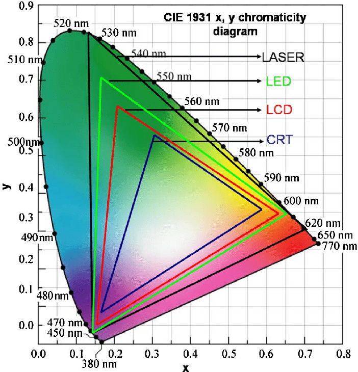
To note that all the new standards generally score very high on the Pointer’s Gamut chart. But with REC-2020 scoring 99.9% vs P3 at 88.2%.
www.tftcentral.co.uk/articles/pointers_gamut.htmhttps://www.slideshare.net/hpduiker/acescg-a-common-color-encoding-for-visual-effects-applications
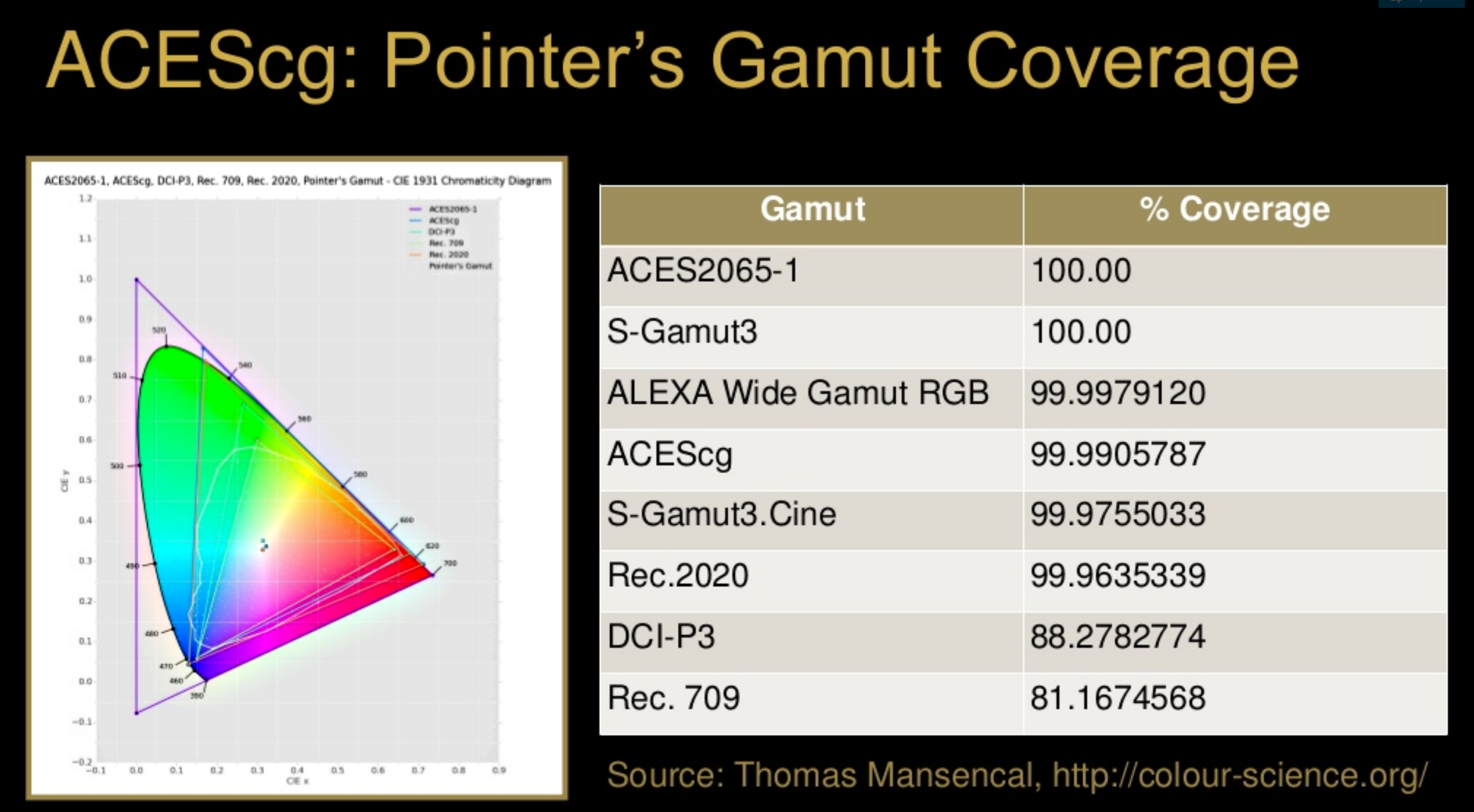
The Pointer’s gamut is (an approximation of) the gamut of real surface colors as can be seen by the human eye, based on the research by Michael R. Pointer (1980). What this means is that every color that can be reflected by the surface of an object of any material is inside the Pointer’s gamut. Basically establishing a widely respected target for color reproduction. Visually, Pointers Gamut represents the colors we see about us in the natural world. Colors outside Pointers Gamut include those that do not occur naturally, such as neon lights and computer-generated colors possible in animation. Which would partially be accounted for with the new gamuts.
cinepedia.com/picture/color-gamut/
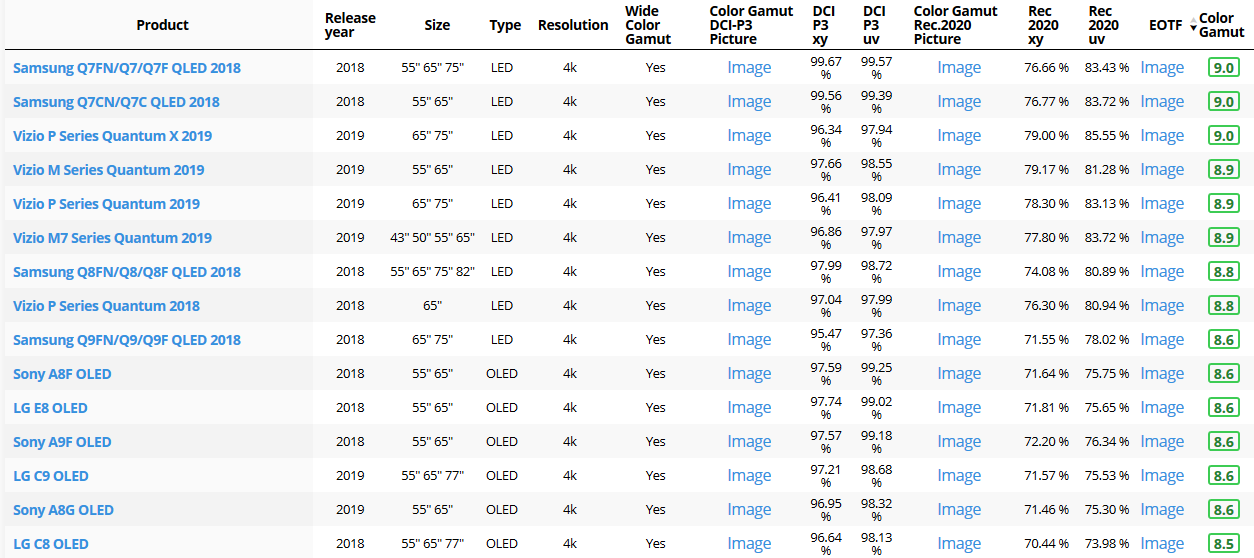
Not all current TVs can support the full spread of the new gamuts. Here is a list of modern TVs’ color coverage in percentage:
www.rtings.com/tv/tests/picture-quality/wide-color-gamut-rec-709-dci-p3-rec-2020There are no TVs that can come close to displaying all the colors within Rec.2020, and there likely won’t be for at least a few years. However, to help future-proof the technology, Rec.2020 support is already baked into the HDR spec. That means that the same genuine HDR media that fills the DCI P3 space on a compatible TV now, will in a few years also fill Rec.2020 on a TV supporting that larger space.
Rec.2020’s main gains are in the number of new tones of green that it will display, though it also offers improvements to the number of blue and red colors as well. Altogether, Rec.2020 will cover about 75% of the visual spectrum, which is a sizeable increase in coverage even over DCI P3.
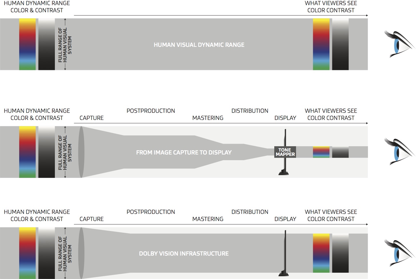
Dolby Vision
https://www.highdefdigest.com/news/show/what-is-dolby-vision/39049
https://www.techhive.com/article/3237232/dolby-vision-vs-hdr10-which-is-best.html
Dolby Vision is a proprietary end-to-end High Dynamic Range (HDR) format that covers content creation and playback through select cinemas, Ultra HD displays, and 4K titles. Like other HDR standards, the process uses expanded brightness to improve contrast between dark and light aspects of an image, bringing out deeper black levels and more realistic details in specular highlights — like the sun reflecting off of an ocean — in specially graded Dolby Vision material.
The iPhone 12 Pro gets the ability to record 4K 10-bit HDR video. According to Apple, it is the very first smartphone that is capable of capturing Dolby Vision HDR.
The iPhone 12 Pro takes two separate exposures and runs them through Apple’s custom image signal processor to create a histogram, which is a graph of the tonal values in each frame. The Dolby Vision metadata is then generated based on that histogram. In Laymen’s terms, it is essentially doing real-time grading while you are shooting. This is only possible due to the A14 Bionic chip.
Dolby Vision also allows for 12-bit color, as opposed to HDR10’s and HDR10+’s 10-bit color. While no retail TV we’re aware of supports 12-bit color, Dolby claims it can be down-sampled in such a way as to render 10-bit color more accurately.
Resources for more reading:
https://www.avsforum.com/forum/166-lcd-flat-panel-displays/2812161-what-color-volume.html
wolfcrow.com/say-hello-to-rec-2020-the-color-space-of-the-future/
www.cnet.com/news/ultra-hd-tv-color-part-ii-the-future/
-
IES Light Profiles and editing software
Read more: IES Light Profiles and editing softwarehttp://www.derekjenson.com/3d-blog/ies-light-profiles
https://ieslibrary.com/en/browse#ies
https://leomoon.com/store/shaders/ies-lights-pack
https://docs.arnoldrenderer.com/display/a5afmug/ai+photometric+light
IES profiles are useful for creating life-like lighting, as they can represent the physical distribution of light from any light source.
The IES format was created by the Illumination Engineering Society, and most lighting manufacturers provide IES profile for the lights they manufacture.


-
Photography basics: Color Temperature and White Balance
Read more: Photography basics: Color Temperature and White Balance

Color Temperature of a light source describes the spectrum of light which is radiated from a theoretical “blackbody” (an ideal physical body that absorbs all radiation and incident light – neither reflecting it nor allowing it to pass through) with a given surface temperature.
https://en.wikipedia.org/wiki/Color_temperature
Or. Most simply it is a method of describing the color characteristics of light through a numerical value that corresponds to the color emitted by a light source, measured in degrees of Kelvin (K) on a scale from 1,000 to 10,000.
More accurately. The color temperature of a light source is the temperature of an ideal backbody that radiates light of comparable hue to that of the light source.
As such, the color temperature of a light source is a numerical measurement of its color appearance. It is based on the principle that any object will emit light if it is heated to a high enough temperature, and that the color of that light will shift in a predictable manner as the temperature is increased. The system is based on the color changes of a theoretical “blackbody radiator” as it is heated from a cold black to a white hot state.
So, why do we measure the hue of the light as a “temperature”? This was started in the late 1800s, when the British physicist William Kelvin heated a block of carbon. It glowed in the heat, producing a range of different colors at different temperatures. The black cube first produced a dim red light, increasing to a brighter yellow as the temperature went up, and eventually produced a bright blue-white glow at the highest temperatures. In his honor, Color Temperatures are measured in degrees Kelvin, which are a variation on Centigrade degrees. Instead of starting at the temperature water freezes, the Kelvin scale starts at “absolute zero,” which is -273 Centigrade.
More about black bodies here: https://www.pixelsham.com/2013/03/14/black-body-color

Details in the post
-
GretagMacbeth Color Checker Numeric Values and Middle Gray
Read more: GretagMacbeth Color Checker Numeric Values and Middle GrayThe human eye perceives half scene brightness not as the linear 50% of the present energy (linear nature values) but as 18% of the overall brightness. We are biased to perceive more information in the dark and contrast areas. A Macbeth chart helps with calibrating back into a photographic capture into this “human perspective” of the world.
https://en.wikipedia.org/wiki/Middle_gray
In photography, painting, and other visual arts, middle gray or middle grey is a tone that is perceptually about halfway between black and white on a lightness scale in photography and printing, it is typically defined as 18% reflectance in visible light
Light meters, cameras, and pictures are often calibrated using an 18% gray card[4][5][6] or a color reference card such as a ColorChecker. On the assumption that 18% is similar to the average reflectance of a scene, a grey card can be used to estimate the required exposure of the film.
https://en.wikipedia.org/wiki/ColorChecker

The exposure meter in the camera does not know whether the subject itself is bright or not. It simply measures the amount of light that comes in, and makes a guess based on that. The camera will aim for 18% gray independently, meaning if you take a photo of an entirely white surface, and an entirely black surface you should get two identical images which both are gray (at least in theory). Thus enters the Macbeth chart.

<!–more–>
Note that Chroma Key Green is reasonably close to an 18% gray reflectance.
http://www.rags-int-inc.com/PhotoTechStuff/MacbethTarget/

No Camera Data 
https://upload.wikimedia.org/wikipedia/commons/b/b4/CIE1931xy_ColorChecker_SMIL.svg

RGB coordinates of the Macbeth ColorChecker
https://pdfs.semanticscholar.org/0e03/251ad1e6d3c3fb9cb0b1f9754351a959e065.pdf


-
Key/Fill ratios and scene composition using false colors
Read more: Key/Fill ratios and scene composition using false colors To measure the contrast ratio you will need a light meter. The process starts with you measuring the main source of light, or the key light.
Get a reading from the brightest area on the face of your subject. Then, measure the area lit by the secondary light, or fill light. To make sense of what you have just measured you have to understand that the information you have just gathered is in F-stops, a measure of light. With each additional F-stop, for example going one stop from f/1.4 to f/2.0, you create a doubling of light. The reverse is also true; moving one stop from f/8.0 to f/5.6 results in a halving of the light.
Let’s say you grabbed a measurement from your key light of f/8.0. Then, when you measured your fill light area, you get a reading of f/4.0. This will lead you to a contrast ratio of 4:1 because there are two stops between f/4.0 and f/8.0 and each stop doubles the amount of light. In other words, two stops x twice the light per stop = four times as much light at f/8.0 than at f/4.0.
theslantedlens.com/2017/lighting-ratios-photo-video/
Examples in the post


COLLECTIONS
| Featured AI
| Design And Composition
| Explore posts
POPULAR SEARCHES
unreal | pipeline | virtual production | free | learn | photoshop | 360 | macro | google | nvidia | resolution | open source | hdri | real-time | photography basics | nuke
FEATURED POSTS
-
GretagMacbeth Color Checker Numeric Values and Middle Gray
-
Principles of Animation with Alan Becker, Dermot OConnor and Shaun Keenan
-
Python and TCL: Tips and Tricks for Foundry Nuke
-
Advanced Computer Vision with Python OpenCV and Mediapipe
-
The CG Career YouTube channel is live!
-
Eddie Yoon – There’s a big misconception about AI creative
-
Ethan Roffler interviews CG Supervisor Daniele Tosti
-
Matt Gray – How to generate a profitable business
Social Links
DISCLAIMER – Links and images on this website may be protected by the respective owners’ copyright. All data submitted by users through this site shall be treated as freely available to share.
