COMPOSITION
-
Composition – cinematography Cheat Sheet
Read more: Composition – cinematography Cheat SheetWhere is our eye attracted first? Why?
Size. Focus. Lighting. Color.
Size. Mr. White (Harvey Keitel) on the right.
Focus. He’s one of the two objects in focus.
Lighting. Mr. White is large and in focus and Mr. Pink (Steve Buscemi) is highlighted by
a shaft of light.
Color. Both are black and white but the read on Mr. White’s shirt now really stands out.
What type of lighting?-> High key lighting.
Features bright, even illumination and few conspicuous shadows. This lighting key is often used in musicals and comedies.Low key lighting
Features diffused shadows and atmospheric pools of light. This lighting key is often used in mysteries and thrillers.High contrast lighting
Features harsh shafts of lights and dramatic streaks of blackness. This type of lighting is often used in tragedies and melodramas.What type of shot?
Extreme long shot
Taken from a great distance, showing much of the locale. Ifpeople are included in these shots, they usually appear as mere specks-> Long shot
Corresponds to the space between the audience and the stage in a live theater. The long shots show the characters and some of the locale.Full shot
Range with just enough space to contain the human body in full. The full shot shows the character and a minimal amount of the locale.Medium shot
Shows the human figure from the knees or waist up.Close-Up
Concentrates on a relatively small object and show very little if any locale.Extreme close-up
Focuses on an unnaturally small portion of an object, giving that part great detail and symbolic significance.What angle?
Bird’s-eye view.
The shot is photographed directly from above. This type of shot can be disorienting, and the people photographed seem insignificant.High angle.
This angle reduces the size of the objects photographed. A person photographed from this angle seems harmless and insignificant, but to a lesser extent than with the bird’s-eye view.-> Eye-level shot.
The clearest view of an object, but seldom intrinsically dramatic, because it tends to be the norm.Low angle.
This angle increases high and a sense of verticality, heightening the importance of the object photographed. A person shot from this angle is given a sense of power and respect.Oblique angle.
For this angle, the camera is tilted laterally, giving the image a slanted appearance. Oblique angles suggest tension, transition, a impending movement. They are also called canted or dutch angles.What is the dominant color?
The use of color in this shot is symbolic. The scene is set in warehouse. Both the set and characters are blues, blacks and whites.
This was intentional allowing for the scenes and shots with blood to have a great level of contrast.
What is the Lens/Filter/Stock?
Telephoto lens.
A lens that draws objects closer but also diminishes the illusion of depth.Wide-angle lens.
A lens that takes in a broad area and increases the illusion of depth but sometimes distorts the edges of the image.Fast film stock.
Highly sensitive to light, it can register an image with little illumination. However, the final product tends to be grainy.Slow film stock.
Relatively insensitive to light, it requires a great deal of illumination. The final product tends to look polished.The lens is not wide-angle because there isn’t a great sense of depth, nor are several planes in focus. The lens is probably long but not necessarily a telephoto lens because the depth isn’t inordinately compressed.
The stock is fast because of the grainy quality of the image.
Subsidiary Contrast; where does the eye go next?
The two guns.
How much visual information is packed into the image? Is the texture stark, moderate, or highly detailed?
Minimalist clutter in the warehouse allows a focus on a character driven thriller.
What is the Composition?
Horizontal.
Compositions based on horizontal lines seem visually at rest and suggest placidity or peacefulness.Vertical.
Compositions based on vertical lines seem visually at rest and suggest strength.-> Diagonal.
Compositions based on diagonal, or oblique, lines seem dynamic and suggest tension or anxiety.-> Binary. Binary structures emphasize parallelism.
Triangle.
Triadic compositions stress the dynamic interplay among three mainCircle.
Circular compositions suggest security and enclosure.Is the form open or closed? Does the image suggest a window that arbitrarily isolates a fragment of the scene? Or a proscenium arch, in which the visual elements are carefully arranged and held in balance?
The most nebulous of all the categories of mise en scene, the type of form is determined by how consciously structured the mise en scene is. Open forms stress apparently simple techniques, because with these unself-conscious methods the filmmaker is able to emphasize the immediate, the familiar, the intimate aspects of reality. In open-form images, the frame tends to be deemphasized. In closed form images, all the necessary information is carefully structured within the confines of the frame. Space seems enclosed and self-contained rather than continuous.
Could argue this is a proscenium arch because this is such a classic shot with parallels and juxtapositions.
Is the framing tight or loose? Do the character have no room to move around, or can they move freely without impediments?
Shots where the characters are placed at the edges of the frame and have little room to move around within the frame are considered tight.
Longer shots, in which characters have room to move around within the frame, are considered loose and tend to suggest freedom.
Center-framed giving us the entire scene showing isolation, place and struggle.
Depth of Field. On how many planes is the image composed (how many are in focus)? Does the background or foreground comment in any way on the mid-ground?
Standard DOF, one background and clearly defined foreground.
Which way do the characters look vis-a-vis the camera?
An actor can be photographed in any of five basic positions, each conveying different psychological overtones.
Full-front (facing the camera):
the position with the most intimacy. The character is looking in our direction, inviting our complicity.Quarter Turn:
the favored position of most filmmakers. This position offers a high degree of intimacy but with less emotional involvement than the full-front.-> Profile (looking of the frame left or right):
More remote than the quarter turn, the character in profile seems unaware of being observed, lost in his or her own thoughts.Three-quarter Turn:
More anonymous than the profile, this position is useful for conveying a character’s unfriendly or antisocial feelings, for in effect, the character is partially turning his or her back on us, rejecting our interest.Back to Camera:
The most anonymous of all positions, this position is often used to suggest a character’s alienation from the world. When a character has his or her back to the camera, we can only guess what’s taking place internally, conveying a sense of concealment, or mystery.How much space is there between the characters?
Extremely close, for a gunfight.
The way people use space can be divided into four proxemic patterns.
Intimate distances.
The intimate distance ranges from skin contact to about eighteen inches away. This is the distance of physical involvement–of love, comfort, and tenderness between individuals.-> Personal distances.
The personal distance ranges roughly from eighteen inches away to about four feet away. These distances tend to be reserved for friends and acquaintances. Personal distances preserve the privacy between individuals, yet these rages don’t necessarily suggest exclusion, as intimate distances often do.Social distances.
The social distance rages from four feet to about twelve feet. These distances are usually reserved for impersonal business and casual social gatherings. It’s a friendly range in most cases, yet somewhat more formal than the personal distance.Public distances.
The public distance extends from twelve feet to twenty-five feet or more. This range tends to be formal and rather detached. -
Photography basics: Camera Aspect Ratio, Sensor Size and Depth of Field – resolutions
Read more: Photography basics: Camera Aspect Ratio, Sensor Size and Depth of Field – resolutionshttp://www.shutterangle.com/2012/cinematic-look-aspect-ratio-sensor-size-depth-of-field/
http://www.shutterangle.com/2012/film-video-aspect-ratio-artistic-choice/
DESIGN
-
James Gerde – The way the leaves dance in the rain
Read more: James Gerde – The way the leaves dance in the rainhttps://www.instagram.com/gerdegotit/reel/C6s-2r2RgSu/
Since spending a lot of time recently with SDXL I’ve since made my way back to SD 1.5
While the models overall have less fidelity. There is just no comparing to the current motion models we have available for animatediff with 1.5 models.
To date this is one of my favorite pieces. Not because I think it’s even the best it can be. But because the workflow adjustments unlocked some very important ideas I can’t wait to try out.
Performance by @silkenkelly and @itxtheballerina on IG
COLOR
-
Composition – cinematography Cheat Sheet
Read more: Composition – cinematography Cheat SheetWhere is our eye attracted first? Why?
Size. Focus. Lighting. Color.
Size. Mr. White (Harvey Keitel) on the right.
Focus. He’s one of the two objects in focus.
Lighting. Mr. White is large and in focus and Mr. Pink (Steve Buscemi) is highlighted by
a shaft of light.
Color. Both are black and white but the read on Mr. White’s shirt now really stands out.
What type of lighting?-> High key lighting.
Features bright, even illumination and few conspicuous shadows. This lighting key is often used in musicals and comedies.Low key lighting
Features diffused shadows and atmospheric pools of light. This lighting key is often used in mysteries and thrillers.High contrast lighting
Features harsh shafts of lights and dramatic streaks of blackness. This type of lighting is often used in tragedies and melodramas.What type of shot?
Extreme long shot
Taken from a great distance, showing much of the locale. Ifpeople are included in these shots, they usually appear as mere specks-> Long shot
Corresponds to the space between the audience and the stage in a live theater. The long shots show the characters and some of the locale.Full shot
Range with just enough space to contain the human body in full. The full shot shows the character and a minimal amount of the locale.Medium shot
Shows the human figure from the knees or waist up.Close-Up
Concentrates on a relatively small object and show very little if any locale.Extreme close-up
Focuses on an unnaturally small portion of an object, giving that part great detail and symbolic significance.What angle?
Bird’s-eye view.
The shot is photographed directly from above. This type of shot can be disorienting, and the people photographed seem insignificant.High angle.
This angle reduces the size of the objects photographed. A person photographed from this angle seems harmless and insignificant, but to a lesser extent than with the bird’s-eye view.-> Eye-level shot.
The clearest view of an object, but seldom intrinsically dramatic, because it tends to be the norm.Low angle.
This angle increases high and a sense of verticality, heightening the importance of the object photographed. A person shot from this angle is given a sense of power and respect.Oblique angle.
For this angle, the camera is tilted laterally, giving the image a slanted appearance. Oblique angles suggest tension, transition, a impending movement. They are also called canted or dutch angles.What is the dominant color?
The use of color in this shot is symbolic. The scene is set in warehouse. Both the set and characters are blues, blacks and whites.
This was intentional allowing for the scenes and shots with blood to have a great level of contrast.
What is the Lens/Filter/Stock?
Telephoto lens.
A lens that draws objects closer but also diminishes the illusion of depth.Wide-angle lens.
A lens that takes in a broad area and increases the illusion of depth but sometimes distorts the edges of the image.Fast film stock.
Highly sensitive to light, it can register an image with little illumination. However, the final product tends to be grainy.Slow film stock.
Relatively insensitive to light, it requires a great deal of illumination. The final product tends to look polished.The lens is not wide-angle because there isn’t a great sense of depth, nor are several planes in focus. The lens is probably long but not necessarily a telephoto lens because the depth isn’t inordinately compressed.
The stock is fast because of the grainy quality of the image.
Subsidiary Contrast; where does the eye go next?
The two guns.
How much visual information is packed into the image? Is the texture stark, moderate, or highly detailed?
Minimalist clutter in the warehouse allows a focus on a character driven thriller.
What is the Composition?
Horizontal.
Compositions based on horizontal lines seem visually at rest and suggest placidity or peacefulness.Vertical.
Compositions based on vertical lines seem visually at rest and suggest strength.-> Diagonal.
Compositions based on diagonal, or oblique, lines seem dynamic and suggest tension or anxiety.-> Binary. Binary structures emphasize parallelism.
Triangle.
Triadic compositions stress the dynamic interplay among three mainCircle.
Circular compositions suggest security and enclosure.Is the form open or closed? Does the image suggest a window that arbitrarily isolates a fragment of the scene? Or a proscenium arch, in which the visual elements are carefully arranged and held in balance?
The most nebulous of all the categories of mise en scene, the type of form is determined by how consciously structured the mise en scene is. Open forms stress apparently simple techniques, because with these unself-conscious methods the filmmaker is able to emphasize the immediate, the familiar, the intimate aspects of reality. In open-form images, the frame tends to be deemphasized. In closed form images, all the necessary information is carefully structured within the confines of the frame. Space seems enclosed and self-contained rather than continuous.
Could argue this is a proscenium arch because this is such a classic shot with parallels and juxtapositions.
Is the framing tight or loose? Do the character have no room to move around, or can they move freely without impediments?
Shots where the characters are placed at the edges of the frame and have little room to move around within the frame are considered tight.
Longer shots, in which characters have room to move around within the frame, are considered loose and tend to suggest freedom.
Center-framed giving us the entire scene showing isolation, place and struggle.
Depth of Field. On how many planes is the image composed (how many are in focus)? Does the background or foreground comment in any way on the mid-ground?
Standard DOF, one background and clearly defined foreground.
Which way do the characters look vis-a-vis the camera?
An actor can be photographed in any of five basic positions, each conveying different psychological overtones.
Full-front (facing the camera):
the position with the most intimacy. The character is looking in our direction, inviting our complicity.Quarter Turn:
the favored position of most filmmakers. This position offers a high degree of intimacy but with less emotional involvement than the full-front.-> Profile (looking of the frame left or right):
More remote than the quarter turn, the character in profile seems unaware of being observed, lost in his or her own thoughts.Three-quarter Turn:
More anonymous than the profile, this position is useful for conveying a character’s unfriendly or antisocial feelings, for in effect, the character is partially turning his or her back on us, rejecting our interest.Back to Camera:
The most anonymous of all positions, this position is often used to suggest a character’s alienation from the world. When a character has his or her back to the camera, we can only guess what’s taking place internally, conveying a sense of concealment, or mystery.How much space is there between the characters?
Extremely close, for a gunfight.
The way people use space can be divided into four proxemic patterns.
Intimate distances.
The intimate distance ranges from skin contact to about eighteen inches away. This is the distance of physical involvement–of love, comfort, and tenderness between individuals.-> Personal distances.
The personal distance ranges roughly from eighteen inches away to about four feet away. These distances tend to be reserved for friends and acquaintances. Personal distances preserve the privacy between individuals, yet these rages don’t necessarily suggest exclusion, as intimate distances often do.Social distances.
The social distance rages from four feet to about twelve feet. These distances are usually reserved for impersonal business and casual social gatherings. It’s a friendly range in most cases, yet somewhat more formal than the personal distance.Public distances.
The public distance extends from twelve feet to twenty-five feet or more. This range tends to be formal and rather detached. -
Tim Kang – calibrated white light values in sRGB color space
Read more: Tim Kang – calibrated white light values in sRGB color space8bit sRGB encoded
2000K 255 139 22
2700K 255 172 89
3000K 255 184 109
3200K 255 190 122
4000K 255 211 165
4300K 255 219 178
D50 255 235 205
D55 255 243 224
D5600 255 244 227
D6000 255 249 240
D65 255 255 255
D10000 202 221 255
D20000 166 196 2558bit Rec709 Gamma 2.4
2000K 255 145 34
2700K 255 177 97
3000K 255 187 117
3200K 255 193 129
4000K 255 214 170
4300K 255 221 182
D50 255 236 208
D55 255 243 226
D5600 255 245 229
D6000 255 250 241
D65 255 255 255
D10000 204 222 255
D20000 170 199 2558bit Display P3 encoded
2000K 255 154 63
2700K 255 185 109
3000K 255 195 127
3200K 255 201 138
4000K 255 219 176
4300K 255 225 187
D50 255 239 212
D55 255 245 228
D5600 255 246 231
D6000 255 251 242
D65 255 255 255
D10000 208 223 255
D20000 175 199 25510bit Rec2020 PQ (100 nits)
2000K 520 435 273
2700K 520 466 358
3000K 520 475 384
3200K 520 480 399
4000K 520 495 446
4300K 520 500 458
D50 520 510 482
D55 520 514 497
D5600 520 514 500
D6000 520 517 509
D65 520 520 520
D10000 479 489 520
D20000 448 464 520 -
Victor Perez – The Color Management Handbook for Visual Effects Artists
Read more: Victor Perez – The Color Management Handbook for Visual Effects ArtistsDigital Color Principles, Color Management Fundamentals & ACES Workflows
-
Björn Ottosson – How software gets color wrong
Read more: Björn Ottosson – How software gets color wronghttps://bottosson.github.io/posts/colorwrong/
Most software around us today are decent at accurately displaying colors. Processing of colors is another story unfortunately, and is often done badly.
To understand what the problem is, let’s start with an example of three ways of blending green and magenta:
- Perceptual blend – A smooth transition using a model designed to mimic human perception of color. The blending is done so that the perceived brightness and color varies smoothly and evenly.
- Linear blend – A model for blending color based on how light behaves physically. This type of blending can occur in many ways naturally, for example when colors are blended together by focus blur in a camera or when viewing a pattern of two colors at a distance.
- sRGB blend – This is how colors would normally be blended in computer software, using sRGB to represent the colors.
Let’s look at some more examples of blending of colors, to see how these problems surface more practically. The examples use strong colors since then the differences are more pronounced. This is using the same three ways of blending colors as the first example.
Instead of making it as easy as possible to work with color, most software make it unnecessarily hard, by doing image processing with representations not designed for it. Approximating the physical behavior of light with linear RGB models is one easy thing to do, but more work is needed to create image representations tailored for image processing and human perception.
Also see:
-
Thomas Mansencal – Colour Science for Python
Read more: Thomas Mansencal – Colour Science for Pythonhttps://thomasmansencal.substack.com/p/colour-science-for-python
https://www.colour-science.org/
Colour is an open-source Python package providing a comprehensive number of algorithms and datasets for colour science. It is freely available under the BSD-3-Clause terms.
LIGHTING
-
Is a MacBeth Colour Rendition Chart the Safest Way to Calibrate a Camera?
Read more: Is a MacBeth Colour Rendition Chart the Safest Way to Calibrate a Camera?www.colour-science.org/posts/the-colorchecker-considered-mostly-harmless/
“Unless you have all the relevant spectral measurements, a colour rendition chart should not be used to perform colour-correction of camera imagery but only for white balancing and relative exposure adjustments.”
“Using a colour rendition chart for colour-correction might dramatically increase error if the scene light source spectrum is different from the illuminant used to compute the colour rendition chart’s reference values.”
“other factors make using a colour rendition chart unsuitable for camera calibration:
– Uncontrolled geometry of the colour rendition chart with the incident illumination and the camera.
– Unknown sample reflectances and ageing as the colour of the samples vary with time.
– Low samples count.
– Camera noise and flare.
– Etc…“Those issues are well understood in the VFX industry, and when receiving plates, we almost exclusively use colour rendition charts to white balance and perform relative exposure adjustments, i.e. plate neutralisation.”
-
LUX vs LUMEN vs NITS vs CANDELA – What is the difference
Read more: LUX vs LUMEN vs NITS vs CANDELA – What is the differenceMore details here: Lumens vs Candelas (candle) vs Lux vs FootCandle vs Watts vs Irradiance vs Illuminance
https://www.inhouseav.com.au/blog/beginners-guide-nits-lumens-brightness/

Candela
Candela is the basic unit of measure of the entire volume of light intensity from any point in a single direction from a light source. Note the detail: it measures the total volume of light within a certain beam angle and direction.
While the luminance of starlight is around 0.001 cd/m2, that of a sunlit scene is around 100,000 cd/m2, which is a hundred millions times higher. The luminance of the sun itself is approximately 1,000,000,000 cd/m2.NIT
https://en.wikipedia.org/wiki/Candela_per_square_metre
The candela per square metre (symbol: cd/m2) is the unit of luminance in the International System of Units (SI). The unit is based on the candela, the SI unit of luminous intensity, and the square metre, the SI unit of area. The nit (symbol: nt) is a non-SI name also used for this unit (1 nt = 1 cd/m2).[1] The term nit is believed to come from the Latin word nitēre, “to shine”. As a measure of light emitted per unit area, this unit is frequently used to specify the brightness of a display device.
NIT and cd/m2 (candela power) represent the same thing and can be used interchangeably. One nit is equivalent to one candela per square meter, where the candela is the amount of light which has been emitted by a common tallow candle, but NIT is not part of the International System of Units (abbreviated SI, from Systeme International, in French).
It’s easiest to think of a TV as emitting light directly, in much the same way as the Sun does. Nits are simply the measurement of the level of light (luminance) in a given area which the emitting source sends to your eyes or a camera sensor.
The Nit can be considered a unit of visible-light intensity which is often used to specify the brightness level of an LCD.
1 Nit is approximately equal to 3.426 Lumens. To work out a comparable number of Nits to Lumens, you need to multiply the number of Nits by 3.426. If you know the number of Lumens, and wish to know the Nits, simply divide the number of Lumens by 3.426.
Most consumer desktop LCDs have Nits of 200 to 300, the average TV most likely has an output capability of between 100 and 200 Nits, and an HDR TV ranges from 400 to 1,500 Nits.
Virtual Production sets currently sport around 6000 NIT ceiling and 1000 NIT wall panels.The ambient brightness of a sunny day with clear blue skies is between 7000-10,000 nits (between 3000-7000 nits for overcast skies and indirect sunlight).
A bright sunny day can have specular highlights that reach over 100,000 nits. Direct sunlight is around 1,600,000,000 nits.
10,000 nits is also the typical brightness of a fluorescent tube – bright, but not painful to look at.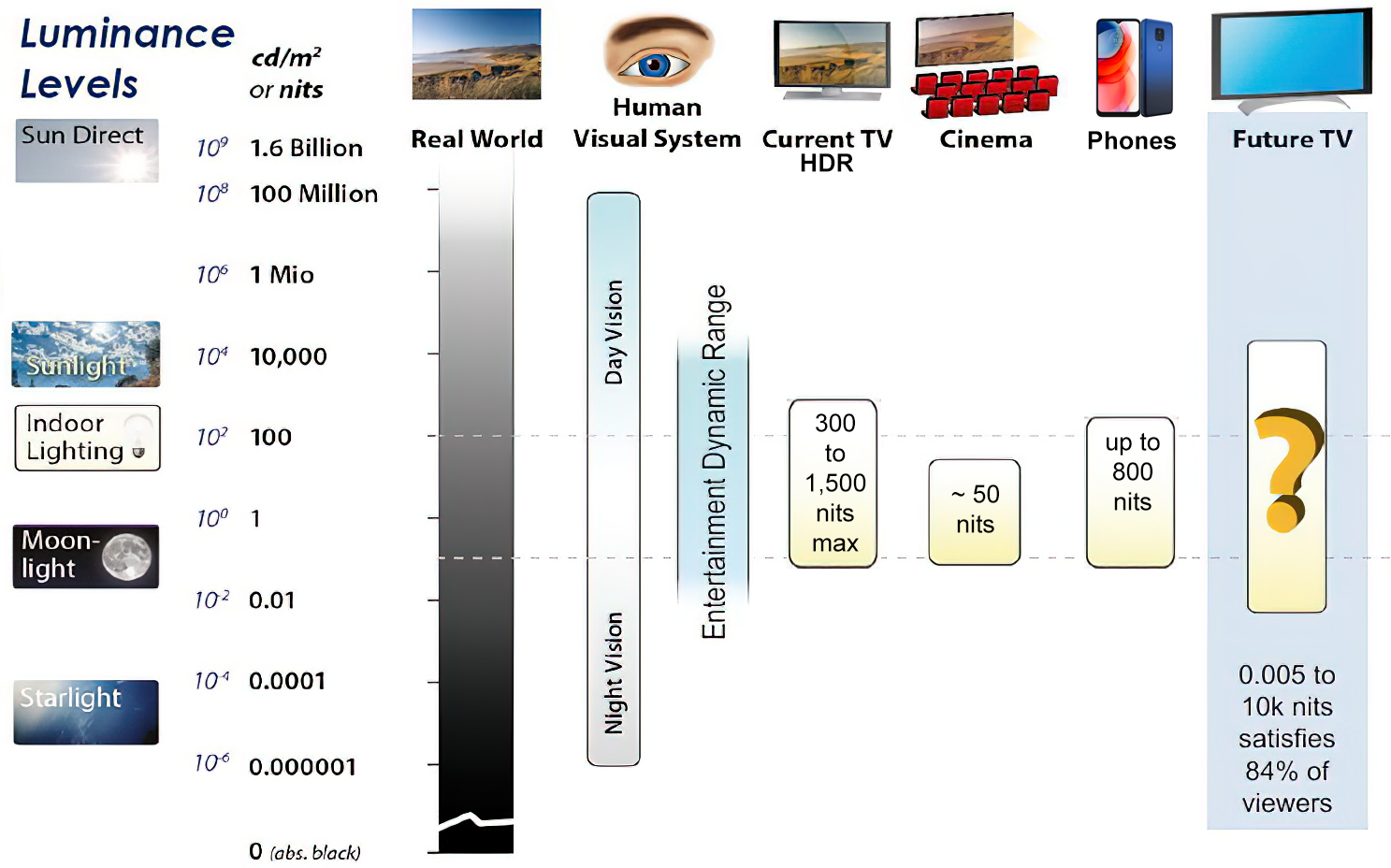
https://www.displaydaily.com/article/display-daily/dolby-vision-vs-hdr10-clarified
Tests showed that a “black level” of 0.005 nits (cd/m²) satisfied the vast majority of viewers. While 0.005 nits is very close to true black, Griffis says Dolby can go down to a black of 0.0001 nits, even though there is no need or ability for displays to get that dark today.
How bright is white? Dolby says the range of 0.005 nits – 10,000 nits satisfied 84% of the viewers in their viewing tests.
The brightest consumer HDR displays today are about 1,500 nits. Professional displays where HDR content is color-graded can achieve up to 4,000 nits peak brightness.High brightness that would be in danger of damaging the eye would be in the neighborhood of 250,000 nits.
Lumens
Lumen is a measure of how much light is emitted (luminance, luminous flux) by an object. It indicates the total potential amount of light from a light source that is visible to the human eye.
Lumen is commonly used in the context of light bulbs or video-projectors as a metric for their brightness power.Lumen is used to describe light output, and about video projectors, it is commonly referred to as ANSI Lumens. Simply put, lumens is how to find out how bright a LED display is. The higher the lumens, the brighter to display!
Technically speaking, a Lumen is the SI unit of luminous flux, which is equal to the amount of light which is emitted per second in a unit solid angle of one steradian from a uniform source of one-candela intensity radiating in all directions.
LUX
Lux (lx) or often Illuminance, is a photometric unit along a given area, which takes in account the sensitivity of human eye to different wavelenghts. It is the measure of light at a specific distance within a specific area at that distance. Often used to measure the incidental sun’s intensity.
-
HDRI Median Cut plugin
Read more: HDRI Median Cut pluginwww.hdrlabs.com/picturenaut/plugins.html

Note. The Median Cut algorithm is typically used for color quantization, which involves reducing the number of colors in an image while preserving its visual quality. It doesn’t directly provide a way to identify the brightest areas in an image. However, if you’re interested in identifying the brightest areas, you might want to look into other methods like thresholding, histogram analysis, or edge detection, through openCV for example.
Here is an openCV example:
# bottom left coordinates = 0,0 import numpy as np import cv2 # Load the HDR or EXR image image = cv2.imread('your_image_path.exr', cv2.IMREAD_UNCHANGED) # Load as-is without modification # Calculate the luminance from the HDR channels (assuming RGB format) luminance = np.dot(image[..., :3], [0.299, 0.587, 0.114]) # Set a threshold value based on estimated EV threshold_value = 2.4 # Estimated threshold value based on 4.8 EV # Apply the threshold to identify bright areas # Theluminancearray contains the calculated luminance values for each pixel in the image. # Thethreshold_valueis a user-defined value that represents a cutoff point, separating "bright" and "dark" areas in terms of perceived luminance.thresholded = (luminance > threshold_value) * 255 # Convert the thresholded image to uint8 for contour detection thresholded = thresholded.astype(np.uint8) # Find contours of the bright areas contours, _ = cv2.findContours(thresholded, cv2.RETR_EXTERNAL, cv2.CHAIN_APPROX_SIMPLE) # Create a list to store the bounding boxes of bright areas bright_areas = [] # Iterate through contours and extract bounding boxes for contour in contours: x, y, w, h = cv2.boundingRect(contour) # Adjust y-coordinate based on bottom-left origin y_bottom_left_origin = image.shape[0] - (y + h) bright_areas.append((x, y_bottom_left_origin, x + w, y_bottom_left_origin + h)) # Store as (x1, y1, x2, y2) # Print the identified bright areas print("Bright Areas (x1, y1, x2, y2):") for area in bright_areas: print(area)More details
Luminance and Exposure in an EXR Image:
- An EXR (Extended Dynamic Range) image format is often used to store high dynamic range (HDR) images that contain a wide range of luminance values, capturing both dark and bright areas.
- Luminance refers to the perceived brightness of a pixel in an image. In an RGB image, luminance is often calculated using a weighted sum of the red, green, and blue channels, where different weights are assigned to each channel to account for human perception.
- In an EXR image, the pixel values can represent radiometrically accurate scene values, including actual radiance or irradiance levels. These values are directly related to the amount of light emitted or reflected by objects in the scene.
The luminance line is calculating the luminance of each pixel in the image using a weighted sum of the red, green, and blue channels. The three float values [0.299, 0.587, 0.114] are the weights used to perform this calculation.
These weights are based on the concept of luminosity, which aims to approximate the perceived brightness of a color by taking into account the human eye’s sensitivity to different colors. The values are often derived from the NTSC (National Television System Committee) standard, which is used in various color image processing operations.
Here’s the breakdown of the float values:
- 0.299: Weight for the red channel.
- 0.587: Weight for the green channel.
- 0.114: Weight for the blue channel.
The weighted sum of these channels helps create a grayscale image where the pixel values represent the perceived brightness. This technique is often used when converting a color image to grayscale or when calculating luminance for certain operations, as it takes into account the human eye’s sensitivity to different colors.
For the threshold, remember that the exact relationship between EV values and pixel values can depend on the tone-mapping or normalization applied to the HDR image, as well as the dynamic range of the image itself.
To establish a relationship between exposure and the threshold value, you can consider the relationship between linear and logarithmic scales:
- Linear and Logarithmic Scales:
- Exposure values in an EXR image are often represented in logarithmic scales, such as EV (exposure value). Each increment in EV represents a doubling or halving of the amount of light captured.
- Threshold values for luminance thresholding are usually linear, representing an actual luminance level.
- Conversion Between Scales:
- To establish a mathematical relationship, you need to convert between the logarithmic exposure scale and the linear threshold scale.
- One common method is to use a power function. For instance, you can use a power function to convert EV to a linear intensity value.
threshold_value = base_value * (2 ** EV)Here,
EVis the exposure value,base_valueis a scaling factor that determines the relationship between EV and threshold_value, and2 ** EVis used to convert the logarithmic EV to a linear intensity value. - Choosing the Base Value:
- The
base_valuefactor should be determined based on the dynamic range of your EXR image and the specific luminance values you are dealing with. - You may need to experiment with different values of
base_valueto achieve the desired separation of bright areas from the rest of the image.
- The
Let’s say you have an EXR image with a dynamic range of 12 EV, which is a common range for many high dynamic range images. In this case, you want to set a threshold value that corresponds to a certain number of EV above the middle gray level (which is often considered to be around 0.18).
Here’s an example of how you might determine a
base_valueto achieve this:# Define the dynamic range of the image in EV dynamic_range = 12 # Choose the desired number of EV above middle gray for thresholding desired_ev_above_middle_gray = 2 # Calculate the threshold value based on the desired EV above middle gray threshold_value = 0.18 * (2 ** (desired_ev_above_middle_gray / dynamic_range)) print("Threshold Value:", threshold_value) -
Photography basics: How Exposure Stops (Aperture, Shutter Speed, and ISO) Affect Your Photos – cheat sheet cards
Read more: Photography basics: How Exposure Stops (Aperture, Shutter Speed, and ISO) Affect Your Photos – cheat sheet cardsAlso see:
https://www.pixelsham.com/2018/11/22/exposure-value-measurements/
https://www.pixelsham.com/2016/03/03/f-stop-vs-t-stop/
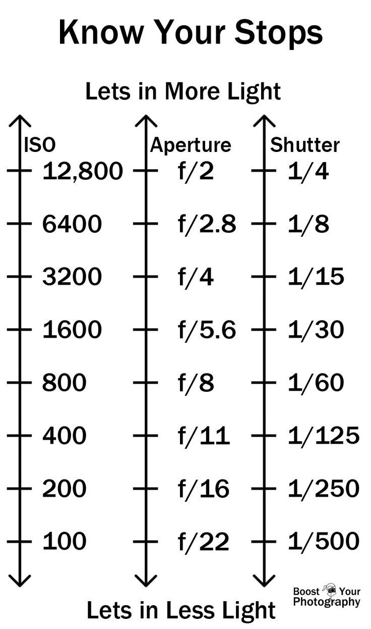
An exposure stop is a unit measurement of Exposure as such it provides a universal linear scale to measure the increase and decrease in light, exposed to the image sensor, due to changes in shutter speed, iso and f-stop.
+-1 stop is a doubling or halving of the amount of light let in when taking a photo
1 EV (exposure value) is just another way to say one stop of exposure change.
https://www.photographymad.com/pages/view/what-is-a-stop-of-exposure-in-photography
Same applies to shutter speed, iso and aperture.
Doubling or halving your shutter speed produces an increase or decrease of 1 stop of exposure.
Doubling or halving your iso speed produces an increase or decrease of 1 stop of exposure.

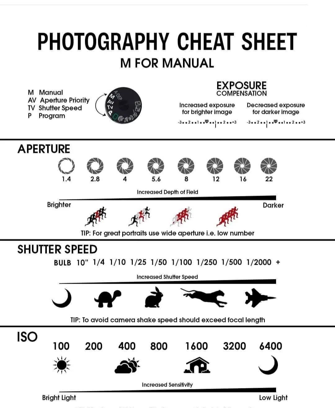
Because of the way f-stop numbers are calculated (ratio of focal length/lens diameter, where focal length is the distance between the lens and the sensor), an f-stop doesn’t relate to a doubling or halving of the value, but to the doubling/halving of the area coverage of a lens in relation to its focal length. And as such, to a multiplying or dividing by 1.41 (the square root of 2). For example, going from f/2.8 to f/4 is a decrease of 1 stop because 4 = 2.8 * 1.41. Changing from f/16 to f/11 is an increase of 1 stop because 11 = 16 / 1.41.

A wider aperture means that light proceeding from the foreground, subject, and background is entering at more oblique angles than the light entering less obliquely.
Consider that absolutely everything is bathed in light, therefore light bouncing off of anything is effectively omnidirectional. Your camera happens to be picking up a tiny portion of the light that’s bouncing off into infinity.
Now consider that the wider your iris/aperture, the more of that omnidirectional light you’re picking up:
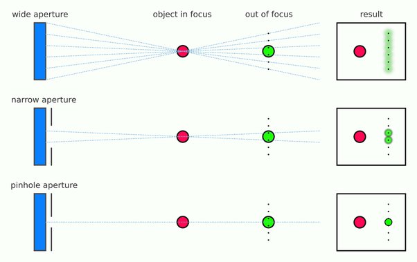
When you have a very narrow iris you are eliminating a lot of oblique light. Whatever light enters, from whatever distance, enters moderately parallel as a whole. When you have a wide aperture, much more light is entering at a multitude of angles. Your lens can only focus the light from one depth – the foreground/background appear blurred because it cannot be focused on.
https://frankwhitephotography.com/index.php?id=28:what-is-a-stop-in-photography
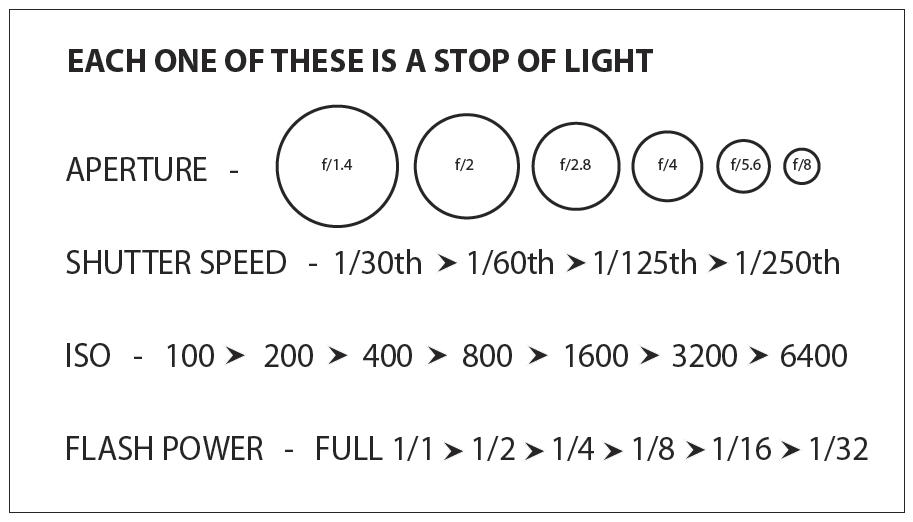
The great thing about stops is that they give us a way to directly compare shutter speed, aperture diameter, and ISO speed. This means that we can easily swap these three components about while keeping the overall exposure the same.
http://lifehacker.com/how-aperture-shutter-speed-and-iso-affect-pictures-sh-1699204484
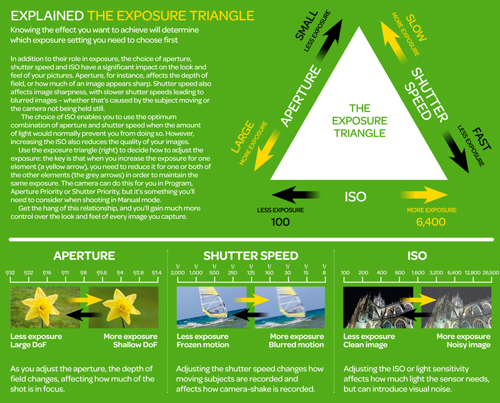
https://www.techradar.com/how-to/the-exposure-triangle
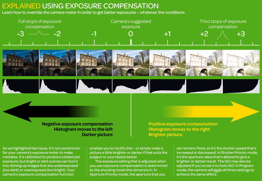
https://www.videoschoolonline.com/what-is-an-exposure-stop
Note. All three of these measurements (aperture, shutter, iso) have full stops, half stops and third stops, but if you look at the numbers they aren’t always consistent. For example, a one third stop between ISO100 and ISO 200 would be ISO133, yet most cameras are marked at ISO125.
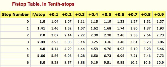
Third-stops are especially important as they’re the increment that most cameras use for their settings. These are just imaginary divisions in each stop.
From a practical standpoint manufacturers only standardize the full stops, meaning that while they try and stay somewhat consistent there is some rounding up going on between the smaller numbers.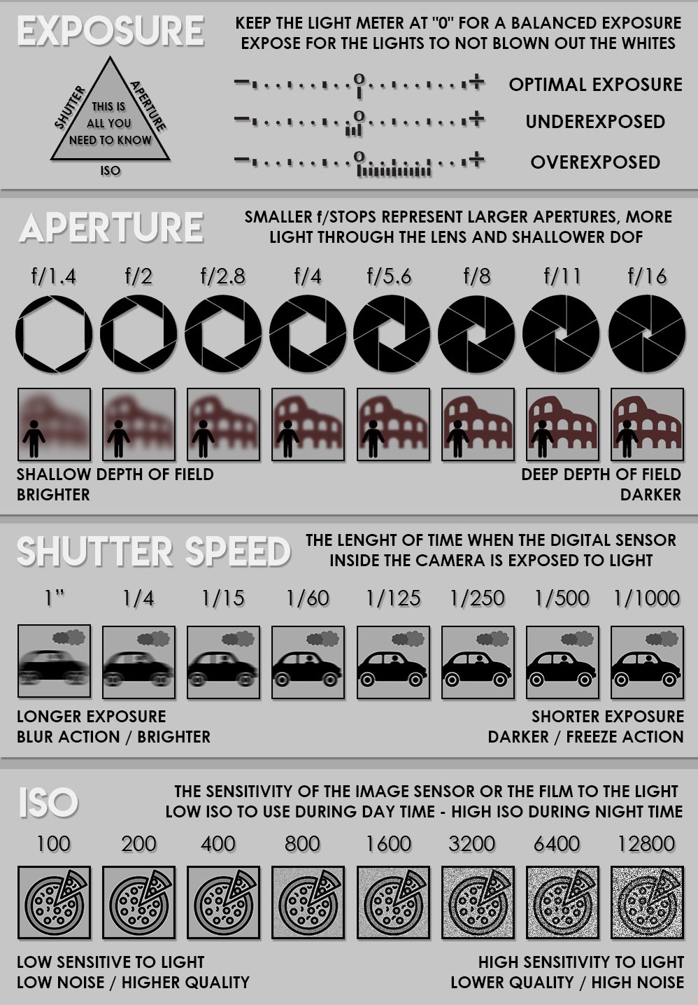
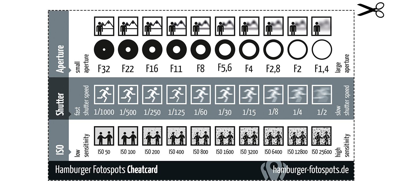
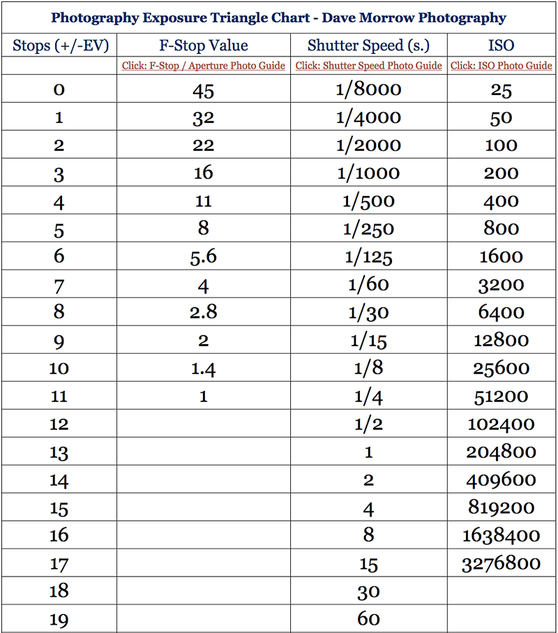
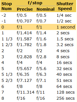
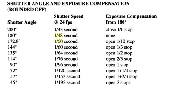
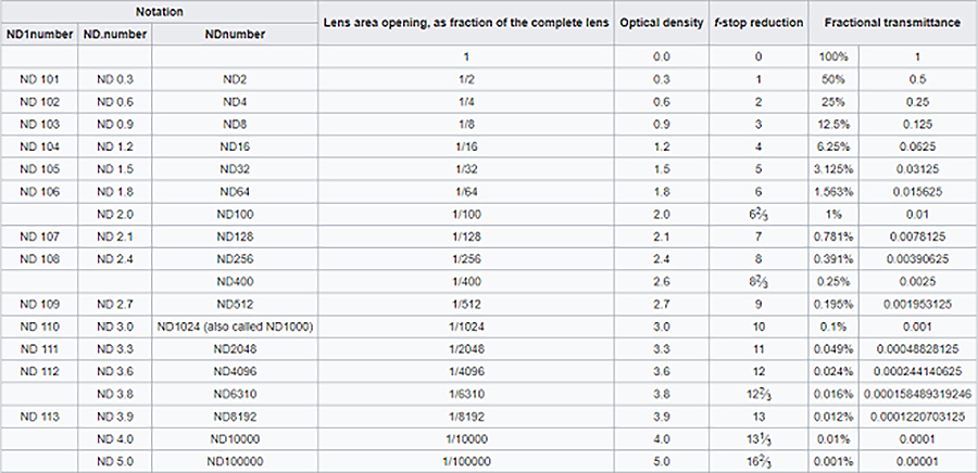
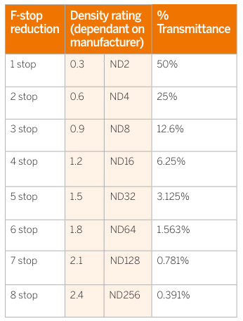
Note that ND Filters directly modify the exposure triangle.

-
Ethan Roffler interviews CG Supervisor Daniele Tosti
Read more: Ethan Roffler interviews CG Supervisor Daniele TostiEthan Roffler
I recently had the honor of interviewing this VFX genius and gained great insight into what it takes to work in the entertainment industry. Keep in mind, these questions are coming from an artist’s perspective but can be applied to any creative individual looking for some wisdom from a professional. So grab a drink, sit back, and enjoy this fun and insightful conversation.
Ethan
To start, I just wanted to say thank you so much for taking the time for this interview!Daniele
My pleasure.
When I started my career I struggled to find help. Even people in the industry at the time were not that helpful. Because of that, I decided very early on that I was going to do exactly the opposite. I spend most of my weekends talking or helping students. ;)Ethan
That’s awesome! I have also come across the same struggle! Just a heads up, this will probably be the most informal interview you’ll ever have haha! Okay, so let’s start with a small introduction!Daniele
Short introduction: I worked very hard and got lucky enough to work on great shows with great people. ;) Slightly longer version: I started working for a TV channel, very early, while I was learning about CG. Slowly made my way across the world, working along very great people and amazing shows. I learned that to be successful in this business, you have to really love what you do as much as respecting the people around you. What you do will improve to the final product; the way you work with people will make a difference in your life.
Ethan
How long have you been an artist?Daniele
Loaded question. I believe I am still trying and craving to be one. After each production I finish I realize how much I still do not know. And how many things I would like to try. I guess in my CG Sup and generalist world, being an artist is about learning as much about the latest technologies and production cycles as I can, then putting that in practice. Having said that, I do consider myself a cinematographer first, as I have been doing that for about 25 years now.Ethan
Words of true wisdom, the more I know the less I know:) How did you get your start in the industry?
How did you break into such a competitive field?Daniele
There were not many schools when I started. It was all about a few magazines, some books, and pushing software around trying to learn how to make pretty images. Opportunities opened because of that knowledge! The true break was learning to work hard to achieve a Suspension of Disbelief in my work that people would recognize as such. It’s not something everyone can do, but I was fortunate to not be scared of working hard, being a quick learner and having very good supervisors and colleagues to learn from.Ethan
Which do you think is better, having a solid art degree or a strong portfolio?Daniele
Very good question. A strong portfolio will get you a job now. A solid strong degree will likely get you a job for a longer period. Let me digress here; Working as an artist is not about being an artist, it’s about making money as an artist. Most people fail to make that difference and have either a poor career or lack the understanding to make a stable one. One should never mix art with working as an artist. You can do both only if you understand business and are fair to yourself.
Ethan
That’s probably the most helpful answer to that question I have ever heard.
What’s some advice you can offer to someone just starting out who wants to break into the industry?Daniele
Breaking in the industry is not just about knowing your art. It’s about knowing good business practices. Prepare a good demo reel based on the skill you are applying for; research all the places where you want to apply and why; send as many reels around; follow up each reel with a phone call. Business is all about right time, right place.Ethan
A follow-up question to that is: Would you consider it a bad practice to send your demo reels out in mass quantity rather than focusing on a handful of companies to research and apply for?Daniele
Depends how desperate you are… I would say research is a must. To improve your options, you need to know which company is working on what and what skills they are after. If you were selling vacuum cleaners you probably would not want to waste energy contacting shoemakers or cattle farmers.Ethan
What do you think the biggest killer of creativity and productivity is for you?Daniele
Money…If you were thinking as an artist. ;) If you were thinking about making money as an artist… then I would say “thinking that you work alone”.Ethan
Best. Answer. Ever.
What are ways you fight complacency and maintain fresh ideas, outlooks, and perspectivesDaniele
Two things: Challenge yourself to go outside your comfort zone. And think outside of the box.Ethan
What are the ways/habits you have that challenge yourself to get out of your comfort zone and think outside the box?Daniele
If you think you are a good character painter, pick up a camera and go take pictures of amazing landscapes. If you think you are good only at painting or sketching, learn how to code in python. If you cannot solve a problem, that being a project or a person, learn to ask for help or learn about looking at the problem from various perspectives. If you are introvert, learn to be extrovert. And vice versa. And so on…
Ethan
How do you avoid burnout?Daniele
Oh… I wish I learned about this earlier. I think anyone that has a passion in something is at risk of burning out. Artists, more than many, because we see the world differently and our passion goes deep. You avoid burnouts by thinking that you are in a long term plan and that you have an obligation to pay or repay your talent by supporting and cherishing yourself and your family, not your paycheck. You do this by treating your art as a business and using business skills when dealing with your career and using artistic skills only when you are dealing with a project itself.Ethan
Looking back, what was a big defining moment for you?Daniele
Recognizing that people around you, those being colleagues, friends or family, come first.
It changed my career overnight.Ethan
Who are some of your personal heroes?Daniele
Too many to list. Most recently… James Cameron; Joe Letteri; Lawrence Krauss; Richard Dawkins. Because they all mix science, art, and poetry in their own way.Ethan
Last question:
What’s your dream job? ;)Daniele
Teaching artists to be better at being business people… as it will help us all improve our lives and the careers we took…
Being a VFX artist is fundamentally based on mistrust.
This because schedules, pipelines, technology, creative calls… all have a native and naive instability to them that causes everyone to grow a genuine but beneficial lack of trust in the status quo. This is a fine balance act to build into your character. The VFX motto: “Love everyone but trust no one” is born on that.
COLLECTIONS
| Featured AI
| Design And Composition
| Explore posts
POPULAR SEARCHES
unreal | pipeline | virtual production | free | learn | photoshop | 360 | macro | google | nvidia | resolution | open source | hdri | real-time | photography basics | nuke
FEATURED POSTS
-
AI Data Laundering: How Academic and Nonprofit Researchers Shield Tech Companies from Accountability
-
What Is The Resolution and view coverage Of The human Eye. And what distance is TV at best?
-
Scene Referred vs Display Referred color workflows
-
Alejandro Villabón and Rafał Kaniewski – Recover Highlights With 8-Bit to High Dynamic Range Half Float Copycat – Nuke
-
STOP FCC – SAVE THE FREE NET
-
Jesse Zumstein – Jobs in games
-
Python and TCL: Tips and Tricks for Foundry Nuke
-
PixelSham – Introduction to Python 2022
Social Links
DISCLAIMER – Links and images on this website may be protected by the respective owners’ copyright. All data submitted by users through this site shall be treated as freely available to share.


